
A2 Media Coursework

PLANNING


I decided it would be good for me to get some practise using Photoshop before I made my poster as I had never used the program before. The poster below is my first attempt. I decided to use an ambiguous photo to create mystery. It is of the actress’ chest, but the lighting and angle make it not obvious what it is of, the image is a still from the party scene of the film. I then overlaid this with the water imagery that runs throughout our film, I liked the subtlety of it but after this I came to the decision that as a piece of marketing material this poster did not give enough information. I wanted to plan for a poster that had an image of my actress and more information about the film.
What I want my poster to include:
-
Image of my actress
-
A still from the film
-
The name of the film
-
Awards
-
Name of filmmakers
-
Water Imagery
The poster below did not fit all of the standards I listed above and it did not turn out as I would have hoped, this makes me want to stick to my plan more. I liked the use of th big title with the birds around it, but the superimposed picture of Beth did not look natural enough. I also liked the idea of the awards/writing being on the right hand side, as you usually would view the poster from left to right and therefore would see the awards last. I could create a poster with the structure like this:

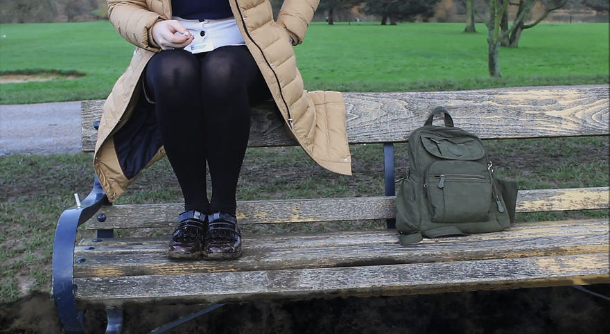
Below is another poster idea which did not materialise the way I wanted it to. I once again decided I wanted to use water imagery and a still from the film, as well as an image of my actress. I edited water running beneath the bench as if the ground is turning to water. This was not as effective as I’d hoped. From this I also realised that an image of my actress was not enough. The image had to be of her face so that it became easily recognisable and more strongly linked to the short film.